Control Center
Led modernization of legacy monitoring tools, enabling multi device accessibility and supporting large scale, mission critical operations.
Role
Design Lead
Employer
IBM
Platforms
Web
Areas
Strategy, Design
Year
2015

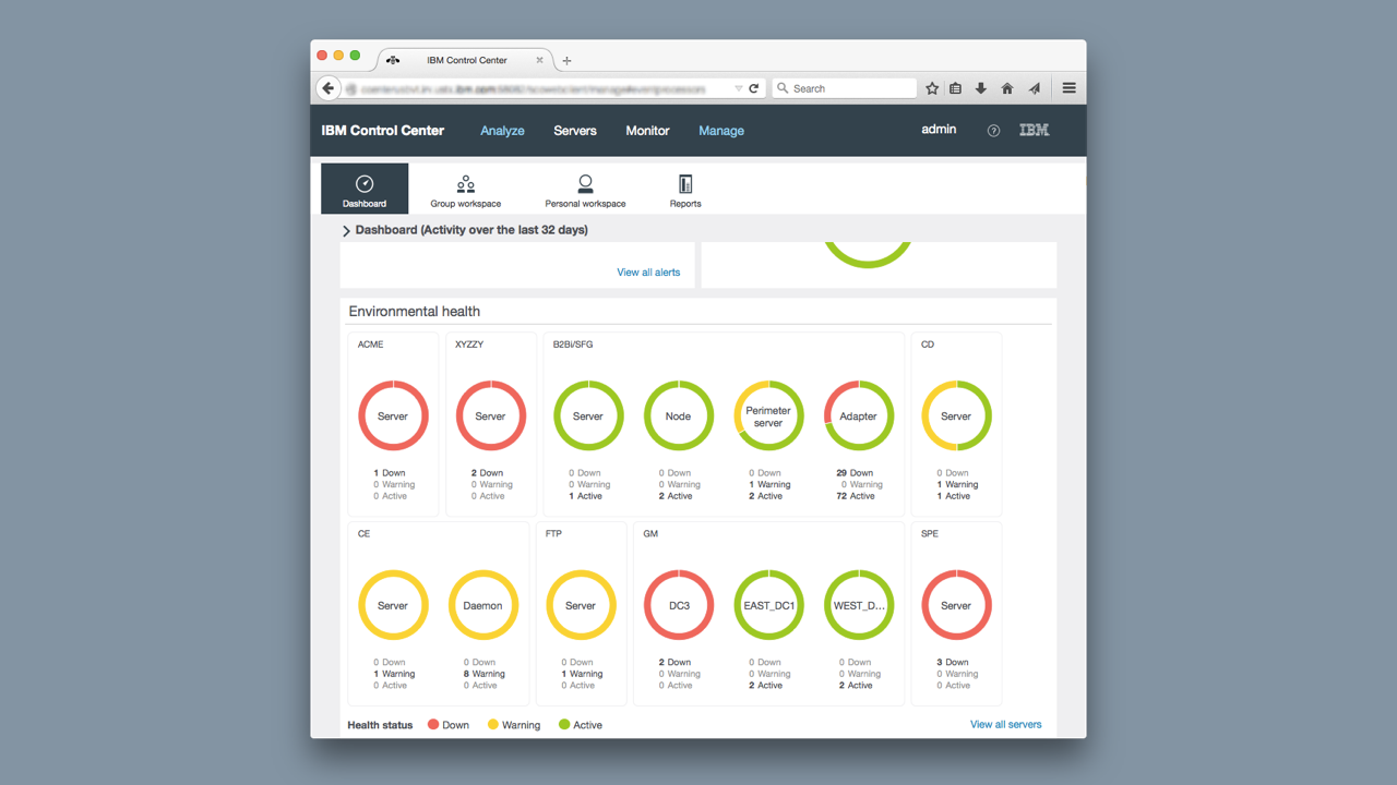
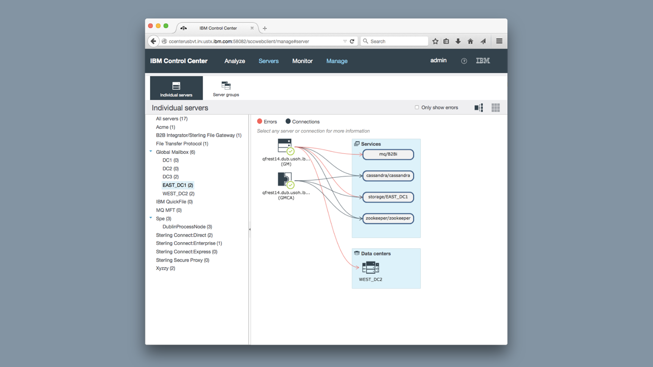
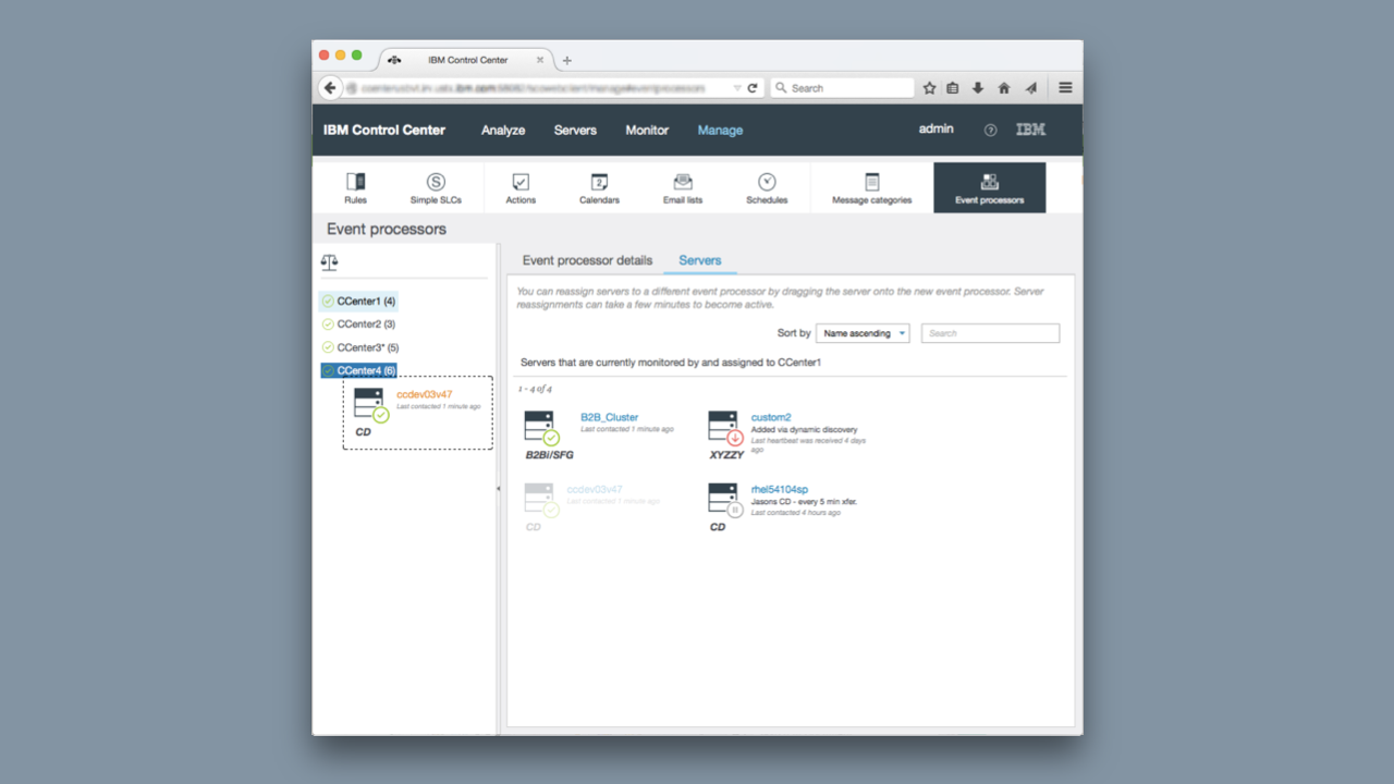
IBM Sterling Control Center unifies event monitoring across all B2B and MFT platforms within a single interface. It ensures governance and compliance for critical data transfers, proactively alerts teams to current or potential issues before SLAs are affected, and uses customizable dashboards, notifications, and reports to make complex data easier to interpret.
Business Goals
1) Modernize legacy monitoring tools by transitioning to a responsive web platform that scales seamlessly, from mobile devices to large display environments, while updating and standardizing UI components.
2) Restore customer confidence by demonstrating clear investment and innovation in the product to reduce churn.
3) Expand market reach by attracting new customers through a modernized user experience.
The Challenge
1)A limited understanding of the problem space and the nuances of the radiology workflow.
2) Insufficient knowledge of our existing customers and their real world needs.
3) A newly formed design team that required alignment on vision, process, and priorities.
4) Tight timelines that demanded rapid discovery, iteration, and validation without sacrificing quality.
The Outcome
The launch of the redesigned monitoring tool led to significant business growth, IBM signed four new enterprise customers, driving a 12% increase in Control Center revenue.
Research & Ideation
To understand how users interacted with their dashboards, we used a mix of task flow analysis and qualitative interviews. Through this research, we uncovered a clear friction point, customers were spending too much time building and adjusting dashboards, and even then, they couldn’t achieve a shared, at-a-glance view across their teams. In many cases, organizations had entire “war rooms” with massive screens displaying these dashboards, yet still found themselves scrolling endlessly, unable to see the complete picture of their operations in real time.
Design strategy
Progressive Disclosure — We needed to show only the most important information. Mainly that everything is running smoothly.
Emphasize legibility — Using color to draw attention to issues as they occurred. Customers needed to quickly identify what went wrong so they could take immediate action. To ensure accessibility, we didn’t rely on color alone—typography, contrast, and clear written indicators were all incorporated to make critical information easy to spot and understand for every user.
Optimize for main workflow — We optimized the solution for the main workflow but allowed customers to customize the dashboard.